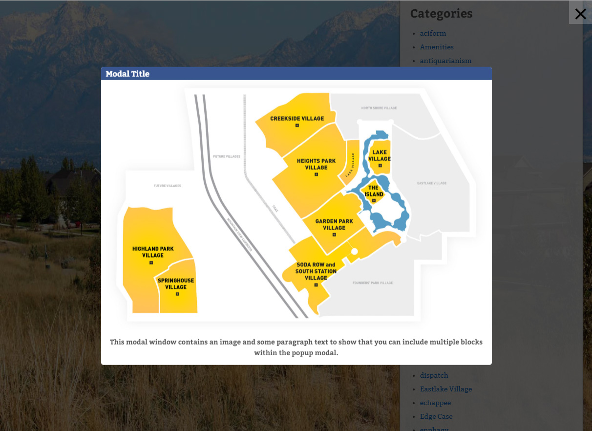
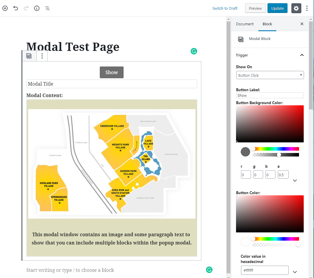
Descripción
This project provides a modal / popup block for the WordPress Gutenberg editor.
- Multiple methods for triggering modal including button, text link, image link, external class, and page load.
- User definable modal content using Gutenberg blocks, for example, image, paragraph etc.
- Support for multiple modal window sizes.
- Modal window transitions for fade, left, right, up down.
- Manual trigger modal initialization by calling bodModal.initModal()
- Custom events for before open, after open, before close, after close so custom code can be used.
- Lots of customizable options including Trigger Button Label, Button Color, Trigger Text, Trigger Text Size, Trigger Image, Trigger Class, Modal Delay, Trigger Element Alignment, Overlay Background Color, Title Text Size, Title Font Color, Title Background Color, Title Padding, Border Radius.
- Supports multiple modals on the same page.
- ADA compliant.
- Modal to modal links.
- Multiple ways to close the modal.
- Escape key
- Close button ‘X’ in the top right of the screen.
- Close button ‘X’ in the modal title.
- Close button at the bottom on the modal content.
- Uses create-guton-block for easy config.
Donations
If you like the plugin, consider a donation to support further development. Click here
Bloques
Este plugin proporciona 1 bloque.
- Modal Guten Block
Instalación
From your WordPress dashboard
- Visit Plugins > Add New
- Search for “Modal Block”
- Install the “Modal Block” plugin
- Activate “Modal Block” from your Plugins page
- Insert Block on your Gutenberg Editor and select “Modal Block” which is located in Widgets.
Reseñas
29 de noviembre de 2023
Simple to use and works perfect for me 😉
21 de noviembre de 2023
It does what it is supposed to do, easily configurable and I love that this is a separate plugin and not part of a collection of blocks. It keeps WordPress nice and lean.
It would be perfect if the color picker would use the regular Gutenberg color palette chooser 🙂
10 de noviembre de 2023
Extremely versatile, works perfect, no issue in several months of use. And honestly, for me, nothing is missing.
I even use it for click something / reveal result. For fun or educational purposes.
Congratulations to the author, it's much better than very good.
24 de octubre de 2023
1 respuesta
Can i control for showing modal in specific pages in my website automaticly?
13 de julio de 2023
Thank you,Very nice plugin
26 de febrero de 2023
Best PopUp - Plugin! Easy to use! Please write an PopUp - Plugin in this way! Maybe with Exit Intent - Functionality
Colaboradores y desarrolladores
«Modal Guten Block» es un software de código abierto. Las siguientes personas han colaborado con este plugin.
ColaboradoresTraduce «Modal Guten Block» a tu idioma.
¿Interesado en el desarrollo?
Revisa el código , echa un vistazo al repositorio SVN o suscríbete al registro de desarrollo por RSS.
Registro de cambios
2.1
- Transition effects (fade, left, right, up, down) and ‘Custom Events’ for before modal open, after open, before close, after close
- Manual trigger modal initialization by calling bodModal.initModal()
2.0
- Modal background images. Separate options into Trigger, Modal, Title and Content panels. Title close X ability to define size. Trigger based on URL text.
1.5
- modal to modal links, text align title, title close button
1.4.3
- Option to disable close modal on Escape key press.
1.4.2
- Fixed issue where clicking on nested content in edit mode resulted in modal edit content box closing.
- When modal opened focus on first element but do not scroll to it. Stops modal opening at bottom.
1.4.1
- Fix for when we trigger on image and image is smaller than medium size. In this case we default in the full size image.
1.4
- Make ADA compliant including using button instead of span, setting / returning focus and focus trapping.
- Add custom class to dialog when modal opens.
- Add toggle option to disable close on overlay click.
1.3
- Optional display only once for timer based modals. Modal Id links timer modals on different pages to say they are the same. Also ability to say how long before modal is shown again.
1.2
- Change icon to use SVG – use alt tag from trigger image – optional close btn in modal
1.1
- Update for deprecated wp.editor (changed to wp.blockEditor) and core/editor (changed to core/block-editor).
1.0.0 (8/19/2019)
- First release

